Thinking about building a website?
Got a website, and want to improve it?
Here are 14 pieces of advice that might help.
If you want me to help you with your author website, write to [email protected].
1. Make it easy for YOU to use and maintain

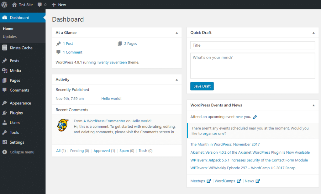
I’ve put this first, and it’s something that people overlook until it’s too late. Your website is just one more job to add to a long list. If you enjoy updating your website, you will keep at it.
Don’t create a large new administrative headache.
2. Page Speed matters

Boring details matter. It’s important that your website is fast. When a page takes a long time to load, visitors click away.
Ways to keep your website fast:
- Minimise plugins
- Optimise images
- Use caching
- Choose a good-quality server and hosting company
- Use a Content Delivery Network (CDN) such as Cloudflare to serve your pages
3. Sell Your Book

As soon as people land on your website, they should immediately know that this is a site about a book or books. A large picture of your book is the best way to do this.
It’s amazing how many people seem to treat their book as an afterthought on their websites. Amazon and other shopping websites take great care to showcase the products on sale above everything else. Your book is your product – that’s why people have come to your website.
Yes, you the author are important, and people want to find out more about you, what makes you tick, how you write, etc.
But the reason they want to know all that is that they love your books.
Give the audience what they want – just like you do when you are writing.
And sell sell sell! Don’t be shy. What’s the use of writing a book if you don’t get it in readers’ hands?
Things to do to sell your book:
- Have prominent links to “Buy Now” on this website, and/or at your retailers’ sites.
- Offer discounts if applicable
- A large picture of your book, with a brief synopsis. Who should buy your book and what will they get out of it? Think about how Amazon sells books.
Whether you like it or not, your website is first and foremost an online shop. Its principle job is to sell books.
4. Make it clean and easy to navigate

Have you read Don’t make me think by Steve Krug? Usability matters. Provide clear signposts to your visitors. Make it obvious how they should use your site. if they have to work hard to understand the site, they will go elsewhere.
That usually means using a tried-and-tested layout. Just as readers know what to expect in a particular genre, so they know where layout elements “ought” to be on a web page.
5. Use social media

Your audience is on Facebook, Instagram, Twitter and possibly LinkedIn, seeking entertainment. You will need to be on one or more of these too. Keep it manageable, but be present where they are.
if you have a large enough readership, you can host a forum on your site where fans can discuss your books with each other and you. Think carefully before doing this, unless you have thousands of highly-engaged fans. If nobody uses it, it will just be an embarrassment and create a lot of work for nothing. It is usually better and easier to have a Facebook page or group instead (but provide lots of links between the site and Facebook).
Inviting people to chat to you online is theoretically great, but can quickly become a large task, so keep an eye on how long you are having to spend replying to comments from fans and don’t let it take you away from writing, and other aspects of marketing. If it becomes unmanageable (a good problem to have) then consider other methods of interacting: invite people to book-signings and author talks, do live Q&As on Facebook, etc.
6. Collect email addresses
If you can collect your visitor’s email addresses, by offering something they will value (a newsletter giving insider news, early access to your latest book, discounts or invitations to events, for example) you will gradually build up a valuable marketing list.
The advantage of email lists is that YOU own then – not your publisher, Facebook, Amazon or anyone else. These are YOUR fans who love reading YOUR books. They will be a loyal and valuable audience, and the very first buyers of your next book. Unless you are very lucky or very famous, it will take you years to build up a large list, so start straight away.
It goes without saying that you must follow the law and best practice when collecting, storing and using data. Respected email services (Mailchimp, AWeber, etc) will make this easy for you.
7. Be a “Constant Gardener” (you never finish a website)
A website is more like a garden than a book. After you put the main parts of a garden in place (the paths, flower beds, lawn), you then have to regularly weed it. You will regularly add or remove plants. In a few years, it will change a lot from what you originally planned.
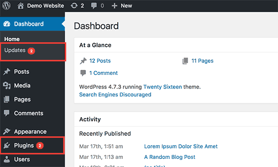
A website is the same. It needs maintenance (updating plugins and themes) and improvement (adding posts and pages, changing images). Accept this and allow for it in your plans.
8. Update your site regularly
This is related to the point above. You need to write new posts regularly, not just when you have a new book to sell. It is important that the site has regular fresh content, both for users and for Search Engine Optimisation (SEO).
Otherwise, why would people come back to your site?
This could mean videos, podcasts, new pages, and a blog.
It will certainly mean updating themes and plugins to remain secure against malware.
9. Yes, you need a blog
For the reasons mentioned above. In fact, you need a blog FIRST. Consider building the blog before anything else (so long as your book is prominently featured on every page).
Decide how often you will realistically post: once a week, or once a month. Stick to it rigidly. Don’t tell people how often you plan to post (that will become a millstone round your neck). Just do it. Email your list when you publish a new post.
Not sure what to write about? Readers are interested in writing. So tell them what you are working on, your thoughts about your next book, insights into your writing process. Tell them about events. Give them extracts from your books. Write short stories and post them for free.
Once you get going, you will find there is no limit to the interesting things you can write about (you are a writer, after all).
10. Don’t expect instant traffic
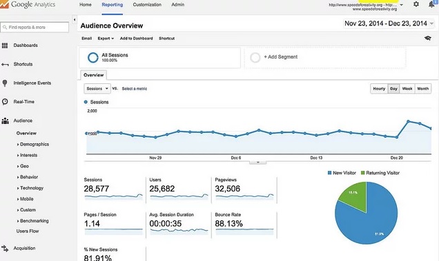
Web traffic, like your readership, takes time to build. Be realistic in your expectations. Don’t spend money you can’t afford on a flashy website, and then be disappointed that nobody visits. Start out simply, and allow the site to improve over time.
Work on sending traffic to your website, using Facebook, author events, and perhaps even paid advertising (if you can prove it is profitable, which is by no means certain).
Be patient, and eventually your hard work will be amply rewarded.
11. Typography matters
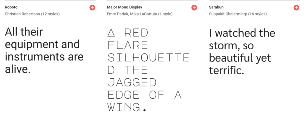
Typography (choice of typeface, font size) is perhaps the most important style decision you will make. Choose something readable. Don’t use more than two typefaces (one serif, one sans serif).
Use black (dark) text on a white (light) background. White on black might look stylish but it’s not readable. It has been established beyond doubt, over many years, that black on white is best. Failing that, at least use dark text on a light background. Don’t give your readers a migraine trying to read your deathless prose.
12. Your website is an extension of the world of your books
People will come to your website because they love your books and can’t enough of the world you have created. They want more of the same, so give it to them.
This means evoking the world of your books in the style, content and tone of voice of the website.
This applies whatever your genre. You have a tone of voice and persona that your readers love, so give it to them.
If you have several pen-names or series, you can split your website into sections, each reflecting one series or pen-name.
13. Use colour carefully

Related to typography above. Choose a small number of colours (for headlines, accents, links, etc) and stick to them.
The colours you choose should reflect your author brand.
You are likely to end up with four or five colours: black (dark) text, white (light) background, a link colour (perhaps red) and ONE other, used sparingly, for headings and highlights. Fewer is usually better.
It is more important that you limit the palette and stick to your decisions than that you choose nice colours.
14. You need superb photography

Photography is the third member of the the holy trinity of web design (with typography and colour).
You can use your own photos, but only if they are very, very good. Above all, you need good photos of your book. Consider hiring a professional photographer, or asking your publisher or a photographer friend to provide photos.
There are lots of good free and paid stock photography websites with fantastic images. Use them, but do so carefully. If you choose boring, predictable stock photos, your website will look like a hastily-assembled marketing PowerPoint.
Good luck!
It’s a daunting task creating a website, but it’s entirely achievable and it’s a lot quicker and easier than writing a book.
If you follow these rules, your website will eventually become a valuable source of new readers, and a means of engaging and retaining existing ones.
I can build an author website for you, or improve an existing one. Write to me for more information: [email protected]


